Hi @ewels
In this blog post MultiQC: A fresh coat of paint | Seqera you mention that
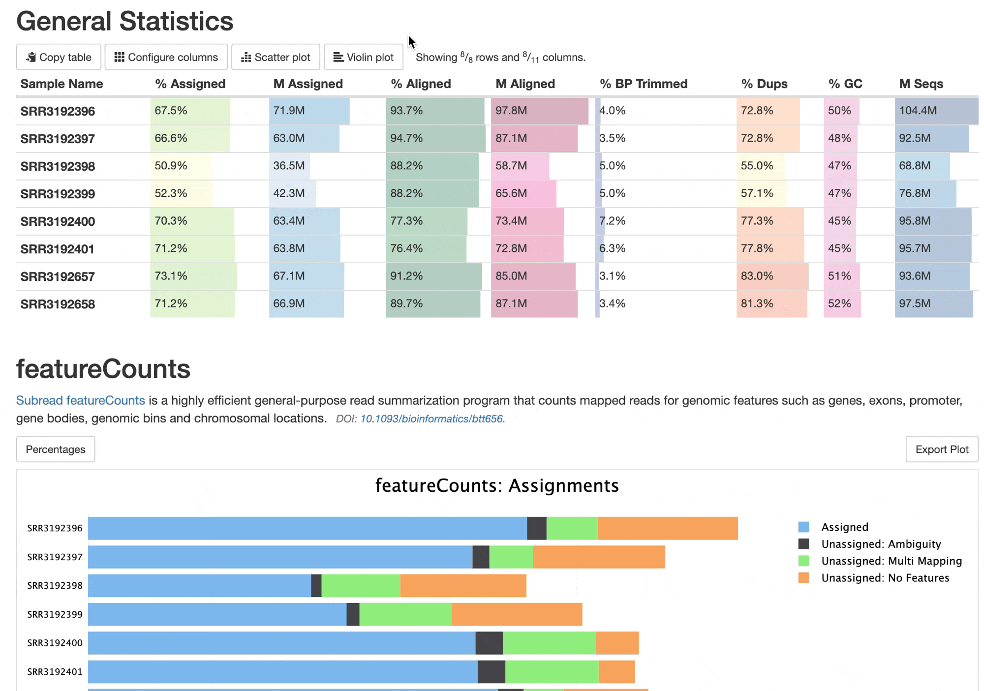
As of MultiQC v1.20, any table can be shown as a violin plot with a simple toggle button in the report, no matter the number of samples
Are there examples on how to do this? Let’s say I wanted to do the same for all the tools that have table output in my pipeline - is there a global config that can be set such that all tables will have the violin plot toggle as shown in the blog gif - https://seqera.io/462fed303ce746e96736c03ef88b5912/multiqc-table-violin-plot.gif
Thanks